
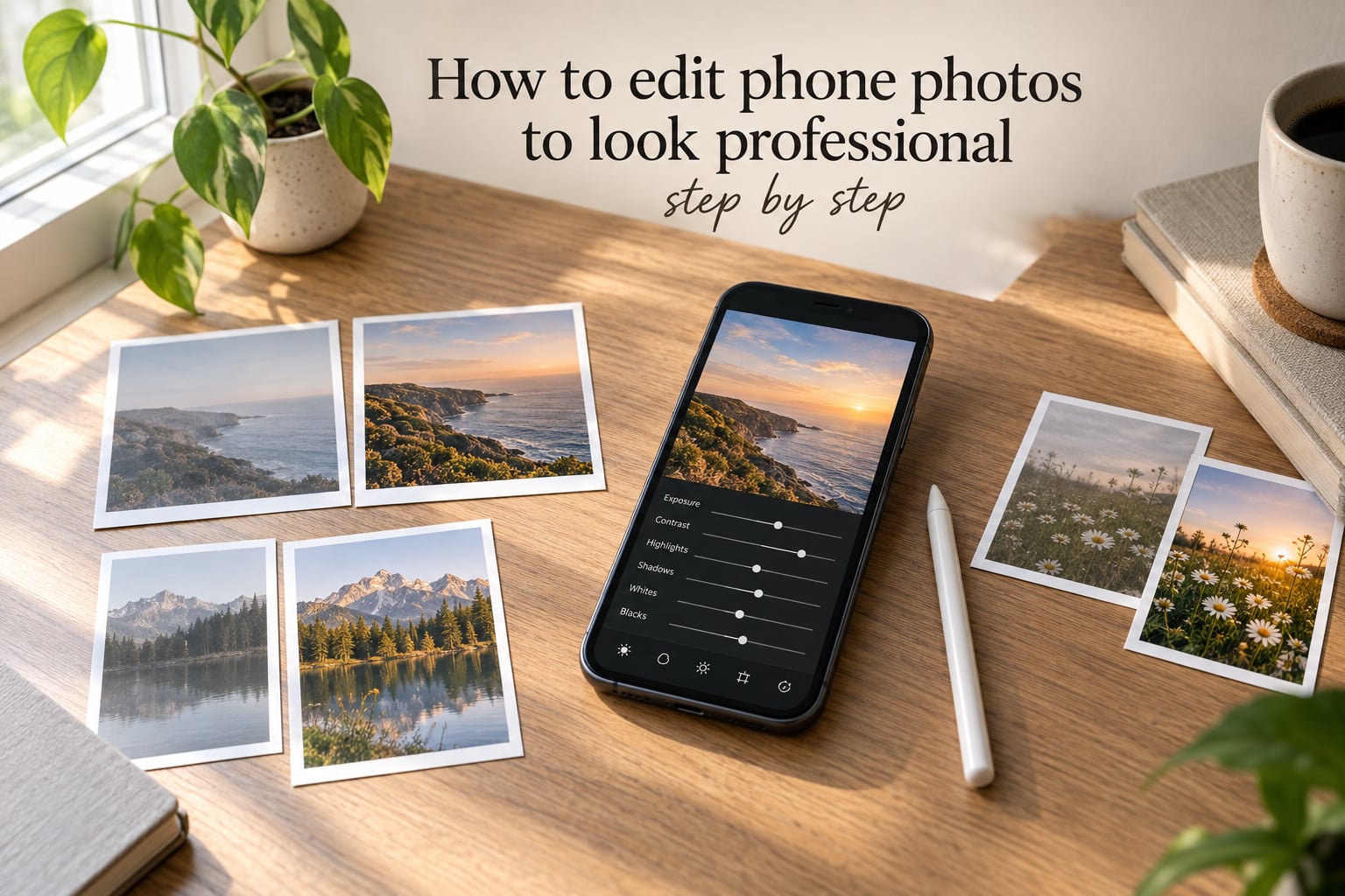
If you’ve ever wondered how to edit phone photos to look professional, the honest answer is this: professional-looking photos are mostly the result of small, deliberate adjustments, not expensive gear. I’ve edited thousands of phone snapshots for our studio clients and family sessions, and the same handful of sliders – exposure, contrast, highlights, shadows, white balance, and a touch of sharpening – do almost all the heavy lifting.
This step-by-step guide walks you through the exact workflow we use at Sparkfly Photography when we polish phone photos for clients. You’ll learn which app to pick, the order to make your edits, what numbers to dial in, and the common mistakes that make phone photos look obviously over-edited. By the end, you’ll have a repeatable process that turns flat, dull snapshots into clean, intentional images.
Table of Contents
- How to Edit Phone Photos to Look Professional: The Full Workflow
- Best Photo Editing Apps for Phone in 2026
- Start With a Good Crop and Straighten
- Adjust Exposure, Contrast, Highlights, and Shadows
- Refine Color: White Balance, Saturation, and Vibrance
- Sharpen, Reduce Noise, and Final Touches
- Quick Wins: 5 Instant Edits Anyone Can Make
- Common Photo Editing Mistakes to Avoid
- Saving and Exporting Phone Photos the Right Way
- Editing Tips for Specific Photo Types
- Frequently Asked Questions
- Final Thoughts: How to Edit Phone Photos to Look Professional
How to Edit Phone Photos to Look Professional: The Full Workflow
How to edit phone photos to look professional comes down to following a consistent order. Skipping steps or working out of sequence is the most common reason phone edits look “off.”
Here’s the seven-step workflow we use on every phone image before it ever reaches a client:
- Crop and straighten the composition.
- Set exposure (overall brightness).
- Recover highlights and lift shadows.
- Add contrast.
- Adjust white balance and tint.
- Refine saturation and vibrance.
- Sharpen gently, then export.
Notice what isn’t on the list: heavy filters, beauty modes, or HDR-style effects. Real professional editing is subtractive. You’re removing problems and letting the photo breathe, not piling on effects. We’ll cover each step in depth below, with the slider values we typically use.
Best Photo Editing Apps for Phone in 2026
The right app matters less than people think, but the wrong app will slow you down. After years of testing mobile editors, our team keeps coming back to the same three tools for most jobs.
Lightroom Mobile: Our Top Recommendation
Lightroom Mobile is the most recommended phone editing app across photography forums for a reason. It gives you the same RAW processing engine Adobe uses on desktop, full slider control over exposure, contrast, highlights, shadows, whites, blacks, white balance, saturation, and vibrance, plus support for presets and selective edits.
The free version is enough for most beginners. Adobe’s Premium plan unlocks the healing tool, selective masking, and cloud sync. If you only install one app for editing phone photos, make it this one.
Snapseed: The Best Free All-Rounder
Snapseed, made by Google, is the most generous free photo editor on phones. Every tool is unlocked with no ads and no watermarks. Its “Tune Image,” “White Balance,” “Details” (sharpening), and “Healing” tools handle 90% of professional edits.
Snapseed shines for quick, one-off adjustments and for users who don’t want a subscription. It lacks presets, but its curve and selective tools actually exceed Lightroom Mobile in some respects.
VSCO: Best for Film-Inspired Looks
VSCO started as a film-emulation preset app and remains the strongest choice if you want a consistent, moody aesthetic across a whole album. The free tier gives you a handful of filters. The paid membership unlocks the full library plus manual editing tools.
Forum users warn that VSCO can lag on older Android phones. If performance matters, test the free version first before committing.
Native Gallery Apps (iOS Photos, Samsung Gallery, Google Photos)
Your phone’s built-in editor has gotten surprisingly capable. iOS Photos, Samsung Gallery, and Google Photos all offer one-tap auto-enhance, plus manual sliders for light, color, and crop. They’re fine for quick fixes but lack the depth of Lightroom or Snapseed.
If you’re new and don’t want to install anything yet, start with your gallery app. You can always graduate later.
Which App Fits Your Skill Level
Beginner: start with your native gallery app or Snapseed.
Intermediate: move to Lightroom Mobile for presets and full slider control.
Advanced: combine Lightroom Mobile (RAW edits) with Snapseed (selective healing and details).
Start With a Good Crop and Straighten
Cropping is the single most underrated edit. A tighter crop removes distractions, strengthens composition, and can completely change the mood of a photo without touching a single color slider. Professional photographers crop aggressively before they ever think about color.
How to Crop for Stronger Composition
When I edit phone photos for our clients, I always crop first, then work on color. Editing color on a poorly cropped image wastes time.
Follow these rules:
- Place your subject off-center using the rule of thirds grid.
- Remove dead space around the edges.
- Cut off anything that competes for attention with the subject.
- Re-crop tighter than feels comfortable. Phone cameras create too much background.
Straightening Horizons and Verticals
Even a one-degree tilt makes a photo look amateur. Most editing apps have a straighten slider or auto-straighten tool. Use it.
For landscapes, align the horizon with the grid line. For architecture, hold vertical lines perfectly vertical. For portraits, align the eyes with the upper horizontal grid line.
Aspect Ratios for Different Uses
Different platforms and prints prefer different ratios:
- 4:5 – Instagram feed and most social posts.
- 16:9 – YouTube thumbnails and desktop wallpapers.
- 3:2 – traditional 35mm ratio, ideal for printing.
- 1:1 – square crops for profile pictures and certain galleries.
Crop once with your final use in mind. Recropping later usually means redoing color work.
Adjust Exposure, Contrast, Highlights, and Shadows
Tonal adjustments – exposure, contrast, highlights, and shadows – are where professional phone edits separate themselves from filtered Instagram posts. The goal isn’t to make the image brighter or darker. It’s to balance the light so the subject looks three-dimensional.
Exposure and Brightness
Exposure is the global brightness of your photo. On phone cameras, the most common mistake is leaving images a touch dark. Most phone photos benefit from a small exposure bump of +0.20 to +0.70 stops.
Watch the histogram while you adjust. If highlights start clipping (piling up against the right edge), pull back. If shadows block up (piling against the left), lift them with the shadows slider instead.
Contrast Without Crushing Blacks
Contrast adds punch but is the slider beginners push hardest. A contrast setting of +20 to +40 is usually plenty. Past +50, your blacks start crushing and skin tones look muddy.
If you want more drama, raise the whites slider slightly and lower the blacks slider slightly instead of cranking contrast. This gives a “filmic” curve without the harsh edges.
Highlights and Shadows Recovery
Highlights are the brightest parts of the image. Shadows are the darkest. Pulling highlights down recovers detail in skies and bright skin. Lifting shadows reveals detail under chins, in dark clothing, and in shadowed backgrounds.
Our typical starting point:
- Highlights: -30 to -60
- Shadows: +20 to +50
- Whites: +10 to +30
- Blacks: -10 to -30
This creates the open, balanced look associated with professional editing.
A Practical Slider Order
Order matters. Here’s the sequence we use, every time:
- Exposure first (set the overall brightness).
- Highlights and shadows (recover detail).
- Whites and blacks (set the tonal range).
- Contrast last (tie everything together).
Skipping this order is why most beginners’ edits look uneven.
Refine Color: White Balance, Saturation, and Vibrance
Color is where phone photos go from “okay” to “professional,” but it’s also where they go from “professional” to “over-edited” fastest. The trick is small, deliberate color shifts.
White Balance and Temperature
White balance controls the warmth or coolness of your image. The temperature slider moves from blue (cool) to yellow (warm). The tint slider moves from green to magenta.
Most phone photos look slightly cool under artificial light or slightly warm under tungsten light. Adjust temperature until whites look truly white, not blue or yellow. Then nudge tint until skin tones look natural, not green or pink.
Saturation vs Vibrance
Saturation boosts every color equally. Vibrance boosts muted colors first and protects skin tones. For portraits, vibrance is almost always the safer choice.
Our typical settings:
- Vibrance: +10 to +25
- Saturation: 0 to +10 for portraits; +10 to +25 for landscapes and food.
If a photo starts to glow orange or the grass looks radioactive, you’ve gone too far. Pull back to zero and start over with vibrance instead.
Reading Skin Tones
Skin should always look like skin. If faces look orange, you’ve oversaturated warmth. If they look gray or pale, you’ve pulled temperature too cool. Zoom in to 100% on a face when judging color.
Sharpen, Reduce Noise, and Final Touches
The final pass adds detail and removes small problems. This is where you stop and resist the urge to keep tweaking.
Gentle Sharpening
Sharpening should be subtle. A sharpening amount of 20 to 40 is plenty for phone photos displayed on screens. Higher values create halos around edges, especially visible around hair and text.
Apply sharpening last, after all other edits. If you sharpen first, then change exposure, you’ll need to re-sharpen.
Healing Tool for Distractions
The healing tool removes small distractions: a stray person in the background, a power line, a pimple on someone’s forehead. Lightroom Mobile and Snapseed both include it.
Use it sparingly. Over-using the healing tool on portraits creates that plastic, over-retouched look.
Selective Edits and Vignettes
Selective edits let you adjust specific parts of an image. You might darken a bright sky, lighten a face in shadow, or boost color in clothing. This is where Lightroom Mobile really shines.
A subtle vignette (-10 to -20) draws the eye toward the subject. Skip it if your subject is at the edge of the frame.
Quick Wins: 5 Instant Edits Anyone Can Make
If you only have 60 seconds, these five edits will improve nearly any phone photo.
- Crop tighter and straighten the horizon.
- Add +0.30 to +0.70 exposure.
- Pull highlights down by 30 to 50.
- Set white balance until whites look truly white.
- Add +10 to +20 vibrance.
These five moves take about a minute and deliver 80% of the visual improvement a full edit provides. I use them as a starting baseline before deciding whether a photo needs more.
Common Photo Editing Mistakes to Avoid
Across thousands of edits and forum discussions with photographers, the same mistakes keep showing up. Avoiding them is honestly more important than learning any new technique.
Over-Pushing Sliders
The single biggest beginner mistake is pushing every slider to its extremes. Contrast +100, saturation +80, sharpening +75. The result looks like a cartoon, not a photograph.
Professional edits use small values. If a slider needs to go past 50 to “see” the effect, you’ve probably gone too far.
Over-Saturating Skin
Human skin should never look orange, red, or yellow. If faces in your edited photos look tanner than they did in real life, you’ve pushed saturation or warmth too hard. Drop saturation to zero and use vibrance instead.
Editing on a Tiny Screen
Phone screens hide problems. Edits that look fine on a 6-inch display can show banding, clipping, or color casts on a monitor or print.
Pinch to zoom to 100% at least once during your edit. Check edges, faces, and skies for issues. Some photographers prefer editing on a tablet for this reason.
Editing Without a Reference
Beginners often edit in a vacuum, with no idea what “natural” looks like. Look at professional photos in your genre – family portraits, food photography, landscapes – and try to match their tonal range and color.
Forgetting to Duplicate First
Always duplicate your image before editing. Phone apps that don’t support non-destructive editing will save over your original. Save a copy, then edit the copy. This is non-negotiable if you ever shoot in RAW.
Saving and Exporting Phone Photos the Right Way
Editing is only half the job. How you save and export determines whether your work survives the trip to social media or a print lab.
Format Choice: JPEG vs RAW
JPEG compresses your image, throwing away data to keep file size small. RAW preserves everything the sensor captured, giving you much more room to recover highlights, fix exposure, and adjust color.
If your phone shoots RAW (most modern iPhones, Samsung Galaxy, and Google Pixel phones do, often labeled “ProRAW” or “Expert RAW”), use it for any photo you intend to edit seriously. RAW files are larger but the editing flexibility is worth it.
For everyday snapshots, JPEG is fine.
Export Resolution and Quality
Always export at the highest quality your app allows. For social media, a 4:5 crop at 1080 pixels wide is standard. For prints, export at 300 DPI at the final print size – so an 8×10 print needs a 2400×3000 pixel file.
Resist the urge to downsample “to save space.” You can never add resolution back later.
Where to Store Originals
Use a cloud backup. iCloud, Google Photos, and Dropbox all work. The most common disaster we hear about from clients is losing phone photos to a broken device – and losing the original along with the edit.
Editing Tips for Specific Photo Types
Different subjects call for different edits. Here are the adjustments we use most often for the photo types our studio shoots.
Portraits
For portraits, protect skin tones above all else. Use vibrance instead of saturation, keep sharpening below 30, and apply a subtle positive clarity (or “structure” in Snapseed) rather than aggressive contrast. Soft, even lighting reads as professional. Harsh shadows read as amateur.
Landscapes
Landscapes benefit from stronger contrast and saturation. Pull highlights way down to recover cloud detail, lift shadows to reveal foreground texture, and push vibrance and saturation slightly higher than you would for portraits. A subtle dehaze slider, available in Lightroom Mobile, can dramatically improve hazy outdoor shots.
Food and Everyday
Food photos need warm tones and a touch of contrast. Boost vibrance, raise temperature slightly, and crop tight. Everyday snapshots – kids, pets, family moments – benefit most from the “Quick Wins” section above. Don’t overthink them.
Frequently Asked Questions
How do I edit my photos to make them look professional?
Use a consistent workflow: crop and straighten first, then adjust exposure, recover highlights and shadows, add modest contrast, refine white balance, boost vibrance sparingly, and sharpen gently. Apps like Lightroom Mobile and Snapseed give you full slider control. Keep every adjustment subtle – professional edits usually use slider values between -50 and +50, never maxed out.
What is the best free photo editing app for phone?
Snapseed is the most generous free photo editor – it has no ads, no watermarks, and unlocks every tool including RAW support, selective edits, and the healing tool. Lightroom Mobile’s free tier is also excellent and adds presets plus RAW editing. Your phone’s built-in gallery app handles basic edits if you’d rather not install anything.
How do I edit iPhone pictures to look professional?
Open the photo in Lightroom Mobile or Snapseed. Start by cropping and straightening, then raise exposure by +0.30 to +0.70. Pull highlights down by 30-50 and lift shadows by 20-40. Adjust white balance until whites look truly white, add vibrance between +10 and +25, and finish with light sharpening. Avoid heavy filters and beauty-mode effects – they read as over-edited.
What are the basic photo editing techniques every beginner should know?
The core techniques are: cropping for stronger composition, exposure correction, highlight and shadow recovery, contrast adjustment, white balance correction, color refinement using vibrance rather than saturation, and gentle sharpening. Learning these seven tools covers more than 90% of professional phone editing.
How can I avoid making my photos look over-edited?
Keep every slider value between -50 and +50, never maxed out. Use vibrance instead of saturation for portraits to protect skin tones. Pinch to 100% zoom at least once during editing to spot issues your phone screen hides. Compare your edit to the original – if the difference is dramatic, you’ve likely gone too far.
Final Thoughts: How to Edit Phone Photos to Look Professional
Knowing how to edit phone photos to look professional isn’t about learning dozens of tools. It’s about following the same seven-step workflow consistently and keeping every adjustment subtle. Pick Lightroom Mobile or Snapseed, crop first, balance your tones, refine color with vibrance, sharpen gently, and export at full quality. The biggest leap forward is simply doing the steps in order, every time.