
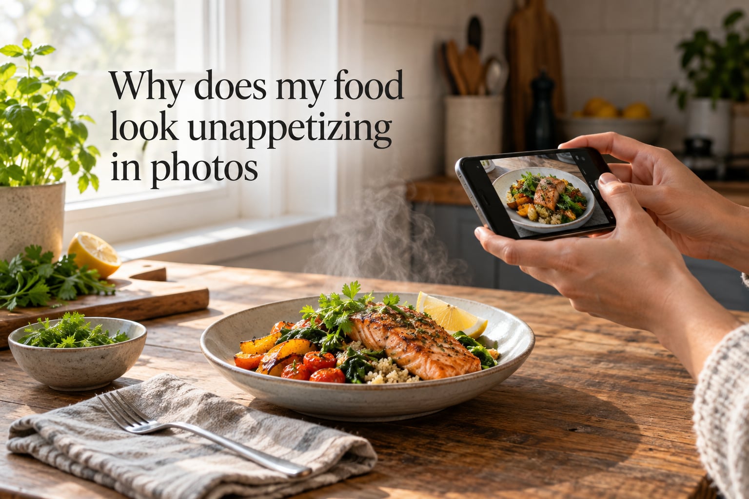
Your food looks unappetizing in photos because cameras record light differently than your eyes do. Harsh flash flattens texture, overhead bulbs add yellow color casts, and wrong angles hide the dish’s best features. The good news: these are all fixable problems, and the fix rarely costs a cent.
I shoot food photos for a living, and I still burned years of dinner party shots before I figured out why my plate looked like cafeteria mush. This guide walks through the exact reasons home cooks struggle, plus the small adjustments that turn a sad photo into one that makes people ask, “Wait, can I come over?” If you’ve ever wondered why does my food look unappetizing in photos when it tastes incredible, you’re in the right place.
Table of Contents
- Why Does My Food Look Unappetizing in Photos? The Top 5 Causes
- The Lighting Problem: Why Flash and Overhead Light Kill Appetite
- Best Angles for Food Photography: 45 Degrees, Overhead, and Eye Level
- Food Styling Tricks That Make Any Dish Look Better on Camera
- White Balance and Color Temperature Explained Simply
- Editing Food Photos Without Looking Fake
- Quick Fixes for Dim Restaurants and Smartphone-Only Shots
- The Color Psychology of Appetite: Why Beige Foods Look Dull
- Common Mistakes in Food Photography (and How to Fix Them)
- Frequently Asked Questions
- How to Make Any Dish Look Better on Camera: The 5-Step Checklist
Why Does My Food Look Unappetizing in Photos? The Top 5 Causes
Most unappetizing food photos come down to five recurring culprits. I see them every week in submissions from home cooks and cottage food business owners.
1. On-camera flash or harsh overhead light. Direct flash creates a plastic, greasy sheen and kills any sense of depth. Even ceiling recessed lights can flatten a dish into a beige smear.
2. Wrong angle for the dish. A burger shot from straight above looks like a sad puck. A soup shot from eye level hides the broth entirely. Angle and food shape have to match.
3. Missing color contrast. Beige chicken on a white plate on a beige counter reads as a single beige blob. The eye (and the camera) needs something to grab onto.
4. No texture cues. Gloss, steam, a crisp edge, a drip of sauce. These are the things that tell the brain “fresh.” Without them, even a beautifully cooked steak can look like rubber.
5. A dirty lens or wrong white balance. Phone pockets are full of lint. That hazy softness ruining your photo might literally be on your camera.
The Lighting Problem: Why Flash and Overhead Light Kill Appetite
Light is the single biggest reason food looks unappetizing in photos. Once you fix lighting, half the other problems quietly solve themselves.
The rule is simple: shoot next to a window, with the light coming from the side or slightly behind the food. Not from above. Not from the camera. From the side.
Side light does something magical. It rakes across the surface of the food and creates tiny shadows in every nook, cranny, and crumb. Those shadows are what your brain reads as texture. Without them, a croissant looks like a lump and a steak looks like a yoga mat.
Natural light by a window
Pull your plate two to three feet from a window. Direct sun is fine for some shots, but a sheer curtain or overcast sky gives the softest results. Shoot with the window to your left or right, never behind you and never behind the food unless you want a silhouette (which can be gorgeous for translucent drinks, by the way).
Why flash fails on food
On-camera flash fires from the same axis as the lens. That means light hits the food head-on, bounces straight back, and erases every shadow that would have told the story of the dish. The result: shiny, flat, vaguely plastic. It is the fastest way to make food look greasy even when it isn’t.
If you take one thing from this whole guide, let it be this: turn the flash off. Forever. For food.
What if there is no window seat?
I’ve shot dozens of restaurant meals in dim rooms with nothing but a candle and a phone. The trick is to find whatever light source exists, get closer to it than feels natural, and tilt the phone so the lens points toward the brightest spot. A white napkin or menu held opposite the light acts as a cheap reflector and bounces soft fill back into the shadows.
Best Angles for Food Photography: 45 Degrees, Overhead, and Eye Level
There is no single best angle for food photography. There are three useful ones, and each suits a different kind of dish.
The 45-degree angle
This is the default for plated restaurant meals. It shows the top of the food and a bit of the side, so you see the ingredients and the height of the stack at once. Use it for pasta, rice bowls, plated proteins, and most composed dishes.
Overhead (flat lay)
Straight-down works beautifully for spreads, charcuterie boards, pancakes, and any food where the interesting part is on top. It flattens height, so don’t use it for a tall burger or a layered cake. The eye reads those as sad discs from above.
Eye level
Eye level is dramatic. It’s also unforgiving. Use it for stacked or layered foods (burgers, sandwiches, cakes with visible filling) where you want the camera to share the diner’s perspective. Keep the background clean because everything at eye level is in focus.
Whatever angle you choose, turn the grid on. Most phones have a rule-of-thirds grid in the camera settings. Place the main element on a grid line, not dead center, and your composition will instantly look more intentional.
Food Styling Tricks That Make Any Dish Look Better on Camera
Styling is where food photos either come alive or stay flat. You don’t need tweezers or a styling kit. You need three things: color contrast, texture cues, and one honest imperfection.
Add color contrast
If your dish is brown, put something green next to it. If it’s green, add a red or yellow accent. A sprinkle of chopped parsley, a lemon wedge, a few chili flakes. The camera sees color contrast as freshness, even when the food underneath is identical.
Show texture cues
Brush a little oil on a roasted vegetable to bring out the gloss. Steam a bowl of soup right before the shot so the vapor catches the light. Tear a piece of bread so the inside is visible. Texture is the appetite cue that photography can’t fake in editing later.
Keep one honest imperfection
Perfect food reads as fake. A single crumb on the cutting board, a small drip of sauce, a slightly tilted fork. These tiny flaws make the photo feel homemade and real. Stock photo galleries over-garnish; home photos do better with restraint.
Background and props
The plate is the star. The background should support, not compete. Wood, linen, slate, marble, and simple ceramic all work. Skip busy tablecloths, branded packaging, and anything that pulls the eye away from the food.
White Balance and Color Temperature Explained Simply
White balance is just your camera’s answer to the question: what in this scene is white? When the camera guesses wrong, your food gets a yellow, orange, or blue tint that makes it look off.
Why household bulbs ruin food color
Most home bulbs are warm. They put out a yellowish light. Your eyes adjust so you don’t notice. Your camera doesn’t. So your plate of pasta ends up looking like it was photographed through honey.
The simple fix
Open your camera’s white balance settings (most phones have this buried in Pro mode or under a color temperature slider). Tap a white napkin or piece of paper in the same light, and that becomes your new “white.” The yellow tint disappears.
If you don’t want to fiddle with settings, shoot near the window. Daylight is the easiest color temperature for cameras to read correctly. It’s also why every food blogger on Instagram seems to have the same golden-hour glow.
Editing Food Photos Without Looking Fake
Editing is where food photos usually die. A heavy filter can make a real meal look like a magazine spread that has been deep-fried in saturation.
Here’s the editing sequence I use on every shot, in this exact order.
Step 1: Exposure. Pull the exposure down just slightly. Slight underexposure protects the bright highlights on glossy food and makes colors read richer.
Step 2: White balance. If the photo is too yellow, slide the warmth toward blue. If it looks blue, slide toward yellow. Tiny moves. Half a tick, not three.
Step 3: Shadows. Lift the shadows a touch to recover detail in darker areas like the inside of a bowl.
Step 4: Vibrance over saturation. Vibrance boosts muted colors without blowing out the already-bright ones. Satation pushes everything. Use vibrance.
Step 5: Sharpen last. A small amount of sharpening brings back the texture you worked so hard to capture.
Skip the preset filters. They are designed to make sunsets and skin look great. They are not designed for chicken.
Quick Fixes for Dim Restaurants and Smartphone-Only Shots
This is the situation I get asked about the most. You’re at dinner, the lighting is moody, and you want a photo that doesn’t look like it was taken in a cave.
First, accept that low light means grain. A clean, slightly grainy shot beats a noisy, blurry one every time. Bump your ISO, not your shutter speed, on a phone that allows manual controls.
Second, lean toward the light. Whatever light exists (candle, pendant, window, sign) is your sun. Move closer to it than feels reasonable.
Third, lock focus on the food by tapping the screen on the part you want sharp. Then hold very still for a beat after pressing the shutter. Phone shutters have a tiny lag and your hand has a tiny tremor. Together they blur.
Fourth, use portrait mode sparingly. It can lift the food from a dim background but it also flattens texture. For a moody cocktail or a slice of cake, portrait mode shines. For a textured pizza, skip it.
Lastly, don’t zoom. Use your feet. Digital zoom on a phone is just a crop, and a crop is just less light on the sensor.
The Color Psychology of Appetite: Why Beige Foods Look Dull
This is the part nobody talks about, and it’s probably the most useful insight in this whole guide.
Human eyes evolved to associate certain colors with ripeness, freshness, and safety. Red, orange, and yellow signal ripe fruit and cooked protein. Green signals fresh. Brown signals cooked, which is fine in small doses but exhausting when it’s the entire plate.
Beige food on a beige plate on a beige counter is a beige photograph. The eye has nothing to land on. It scans, gives up, and moves on without feeling hungry.
This is why restaurant plates are usually white. White is the blank canvas that lets the food’s color do the work. It is also why a single green herb on top of brown food changes everything. The green doesn’t add calories. It adds appetite.
So when your photo looks dull, the fix is often not better light. It’s a piece of parsley, a slice of red chili, or a darker plate.
Common Mistakes in Food Photography (and How to Fix Them)
Most beginners make the same handful of mistakes. Here is the short list, with the quick fix for each.
Shooting from across the room. Get closer. Fill the frame with the food. Negative space is fine, but a tiny plate lost in a wide shot reads as lonely, not appetizing.
Leaving clutter in the background. Move the bills, the laptop, the half-drunk water glass out of frame. The food is the only character in this story.
Forgetting to clean the lens. Wipe your phone lens with a microfiber cloth (or the corner of a clean cotton t-shirt) before every shoot. This is the single most overlooked step and it’s free.
Over-editing with filters. Filters compress the dynamic range and crush texture. They make food look like a candy bar instead of a meal. Use the editing steps above instead.
Photographing food in takeout containers. Styrofoam and plastic clamshells never look good. Plate the food on a real dish, even if you just bought it two minutes ago.
Shooting food that has been sitting out too long. Steam disappears, sauces skin over, garnishes wilt. Have your styling done before the camera comes out.
Frequently Asked Questions
How to make food look more appetizing in pictures?
Move the dish next to a window for soft natural light, shoot from a 45-degree angle for plated meals, and add a small pop of contrasting color like fresh herbs or a lemon wedge. Style the food with one honest imperfection and edit with vibrance rather than saturation for a natural finish.
Why does food look so unappetizing?
Food looks unappetizing in photos because on-camera flash flattens texture, wrong angles hide the dish’s best features, and beige-on-beige color schemes give the eye nothing to grab. Cameras also see color casts from household bulbs that human eyes automatically ignore, which can give food a yellow or orange tint.
Why do my photos look so flat?
Photos look flat when light comes from the same direction as the lens, like overhead recessed lights or on-camera flash. Side light from a window creates the small shadows that read as texture. Move next to a window or add a reflector opposite the light source to restore depth.
What are some common mistakes in food photography?
The most common mistakes are using on-camera flash, shooting from the wrong angle for the dish, leaving a dirty lens, photographing food in takeout containers, over-editing with filters, and waiting too long so steam and freshness disappear. Wipe the lens, turn off flash, plate the food on a real dish, and shoot promptly.
How to make food photography look good?
Use soft natural light from a window at a 45-degree angle, choose an angle that fits the dish, add color contrast with herbs or a slice of citrus, clean your phone lens before shooting, and edit with small adjustments to exposure, white balance, shadows, and vibrance rather than heavy filters.
What is the best angle for food photography?
There is no single best angle, but the 45-degree angle is the most versatile default for plated meals with height. Overhead flat lays work best for spreads and bowls, and eye-level shots are dramatic for stacked foods like burgers and layered cakes.
What are some tips for lighting food photography?
Shoot next to a window with light coming from the side or slightly behind the food, use a sheer curtain to diffuse harsh sun, turn off the flash, and use a white napkin or card as a cheap reflector opposite the light source to fill in shadows.
How to Make Any Dish Look Better on Camera: The 5-Step Checklist
When I have only a minute to set up a shot, this is the order I follow. It’s the same checklist I wish someone had handed me years ago.
Step 1: Wipe the lens. A microfiber cloth takes two seconds and fixes more bad photos than any other step.
Step 2: Move to the window. Side light, never overhead, never flash.
Step 3: Pick the angle for the dish. 45 degrees for plated meals, overhead for spreads, eye-level for stacks.
Step 4: Add one contrasting color and one texture cue. An herb, a citrus wedge, a drizzle of oil, a steamy spoon. Just one of each.
Step 5: Edit in small steps. Exposure, white balance, shadows, vibrance, sharpen. Skip the filters.
That’s the whole system. Run it once and your photos will already look better than 90% of what’s online. Run it ten times and you’ll have a feel for it that no checklist can teach. The next time you ask yourself why does my food look unappetizing in photos, run these five steps before you blame the recipe. The food was almost never the problem.