
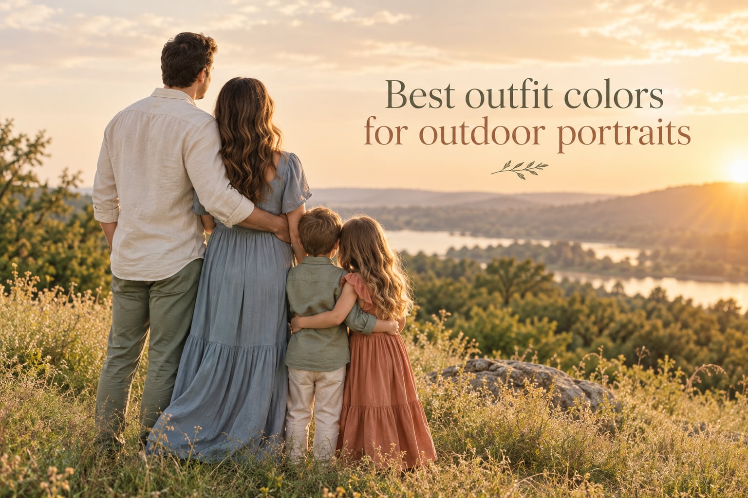
The best outfit colors for outdoor portraits are soft neutrals (cream, tan, oatmeal), muted earth tones (sage, terracotta, dusty blue), and one or two well-chosen accent colors that complement your location and flatter your skin tone. Avoid bright neons, logos, and tiny busy patterns. Aim for harmony, not perfection.
If you have an outdoor photo session coming up, the colors you wear matter more than the brand on the label. I have photographed families, couples, seniors, and engagement sessions outdoors for years, and the outfits that photograph best almost always follow the same simple rules: keep the palette small, let the backdrop lead, and let faces be the focal point. This guide covers the twelve colors that consistently photograph well outside, the colors and patterns to skip, and the coordination formulas that make a group look intentional without looking matchy.
Table of Contents
- What Colors Photograph Best Outdoors? Our Top 12 Picks
- Colors and Patterns to Avoid on Picture Day
- How to Build a Coordinated Outfit Palette (3-3-3 and 60-30-10 Rules)
- Best Colors by Outdoor Location
- Seasonal Color Palettes for Outdoor Portraits
- Color Psychology and Mood in Portraits
- Skin Tone and Undertone Guidance
- Lighting Conditions and Color Choice
- Frequently Asked Questions
- Final Thoughts
What Colors Photograph Best Outdoors? Our Top 12 Picks
The twelve colors below are the ones we recommend most often for outdoor portrait sessions. Each one flatters a wide range of skin tones, holds up against common outdoor backdrops (green grass, blue sky, fall foliage, brick, sand), and stays timeless in print and on screen. Pick two or three from this list for a single person, or use them as your shared family palette.
- Cream, ivory, and oatmeal. These off-whites soften every skin tone, glow in golden hour, and never look harsh outdoors. They pair with literally any second color.
- Soft tan and camel. Warm, neutral, and forgiving. A camel sweater or trousers anchor an outfit without competing with the backdrop.
- Dusty blue and chambray. Reads as blue without the stark contrast of a primary navy. Works in summer grass, at the beach, and against brick.
- Sage green and muted olive. A quiet green that flatters skin and never clashes with foliage. One of the safest outdoor color choices.
- Navy blue. Deeper than dusty blue, navy adds weight and structure. Looks polished against sand, brick, and fall trees.
- Terracotta, rust, and burnt orange. The signature warm-tone outdoor color. Beautiful against blue sky, sand, and greenery; classic with cream and navy.
- Blush pink and dusty rose. Soft, romantic, and flattering. Especially nice in spring and summer light, and on engagement and maternity sessions.
- Lavender and muted lilac. A cool soft pastel that photographs beautifully in overcast light and pairs well with cream, gray, and navy.
- Mint and light sage. A cool green that pops against warm backdrops like brick and sand without competing with grass or trees.
- Warm gray and heather gray. A neutral that grounds an outfit, complements every skin tone, and lets accent colors shine.
- Forest green and emerald. A deeper jewel tone that adds richness in fall and winter sessions and pairs with rust, cream, and burgundy.
- Burgundy, wine, and aubergine. Deep jewel tones that flatter cool and warm skin alike. Beautiful in autumn light and against green foliage.
A quick rule of thumb: if the color is muted rather than saturated, and warm or neutral rather than icy, it will almost always photograph well outside. Save the brightest, purest versions of any color (electric blue, true red, neon yellow) for the kids’ toy bin, not your portraits.
Colors and Patterns to Avoid on Picture Day
The colors and patterns below are the ones photographers flag most often as problematic for outdoor portraits. None of them are deal-breakers if you love the outfit, but they add risk that the photo will look dated, distracting, or unflattering in ten years.
- Fluorescent and neon colors (hot pink, safety orange, neon yellow, lime green). These bounce color back into the skin, especially under the chin and around the eyes, and they draw the eye away from faces.
- Tiny busy patterns (small checks, micro-florals, tight polka dots, houndstooth). They moiré in digital images and look chaotic in print.
- Large bold logos and large text on shirts. They date the photo instantly and pull focus from faces.
- Pure white head-to-toe on a single person in a group. White blows out in bright light and looks like a hole next to other outfits. Off-white and cream are much safer.
- Stark black on top near the face (especially against a dark backdrop). Black absorbs light, creates harsh shadows under the eyes, and can dominate a group photo.
- Very bright primary colors (true red, electric blue, kelly green) in large blocks. They compete with nature and read as costume rather than portrait.
- Shiny or metallic fabrics that catch every reflection. They create hot spots and distract from the subject.
- Clashing plaids between family members. One person in plaid is fine. Three in different plaids looks chaotic.
If you have a piece you absolutely love in one of these categories, use it as your accent only. A neon belt on a neutral outfit is a fun pop. A neon dress is a wardrobe gamble.
How to Build a Coordinated Outfit Palette (3-3-3 and 60-30-10 Rules)
Once you have your color list, the next question is how to actually combine the colors across one outfit or a whole family. Two simple formulas cover almost every situation: the 3-3-3 rule for families, and the 60-30-10 rule for a single outfit or palette balance.
The 3-3-3 Rule for Family and Group Photos
The 3-3-3 rule is simple: pick 3 colors, dress each family member in 3 coordinating pieces (top, bottom, and shoes or a layer), and use those same 3 colors across 3 family members. The repetition creates visual harmony without forcing everyone into identical outfits.
Example palette: cream, dusty blue, terracotta. Mom wears a cream blouse, dusty blue jeans, terracotta flats. Dad wears a terracotta henley, cream chinos, brown boots. Daughter wears a dusty blue dress, cream cardigan, brown sandals. Everyone shares the same three colors but no one is wearing the same outfit.
The 60-30-10 Rule for a Single Outfit or Whole Palette
The 60-30-10 rule is borrowed from interior design and works beautifully for portraits. 60% of the visible clothing is your dominant neutral (cream, tan, gray, navy). 30% is your secondary color (dusty blue, sage, blush). 10% is your accent color, usually introduced through an accessory (scarf, belt, shoes, lipstick, jewelry).
Why this works: the dominant neutral grounds the image and lets the face stand out. The secondary color gives the outfit dimension. The accent adds personality and a place for the eye to rest.
The 20-60-20 Rule in Photography
The 20-60-20 rule is a composition guideline that also helps with color balance: roughly 20% of the frame is your focal accent (often a face or a bright accessory), 60% is the dominant mid-tone (clothing, grass, sand, trees), and 20% is the background and supporting elements. When you choose outfit colors with this split in mind, your subject naturally separates from the backdrop.
For outdoor portraits, that usually means keeping clothing in the 60% mid-tone range (cream, tan, dusty blue, sage) and letting the face plus a small accent (a scarf, a bouquet, a child’s shoe) carry the 20% focal pop. The backdrop does the remaining 20%.
Best Colors by Outdoor Location
The location you are photographing in matters as much as the colors you choose. A color that sings at the beach can disappear against fall foliage. Here is the location-by-location breakdown our team uses when helping clients plan.
Beach and Coastal Sessions
The beach is mostly tan sand, blue or gray water, and an often-bright sky. Stay in the warm-neutral and soft-cool families. Cream, ivory, soft tan, dusty blue, blush pink, sage, and light gray all photograph beautifully. Avoid stark white (it blows out next to bright sand), neon, and deep black (it absorbs all the light on a sunny beach).
Park, Garden, and Grass Sessions
Green grass is your backdrop, which means anything green in the outfit will visually blend into the background. Cream, blush, terracotta, dusty blue, lavender, soft pink, camel, and warm gray all pop against grass. If you want to wear green, shift the hue: sage against deep forest green reads as separate, but kelly green on bright summer grass looks like camouflage.
Fall Foliage Sessions
Fall trees are already a riot of orange, red, and gold. The trick is to coordinate without competing. Jewel tones (burgundy, forest green, navy, aubergine) look rich against fall leaves. Warm earth tones (rust, terracotta, camel, cream) harmonize with the foliage. The one color to avoid at peak fall color: bright red. It blends with the leaves and can read as costume or Christmas-card by mistake.
Winter and Snow Sessions
Snow is bright and reflective. Stay in the deeper jewel and warm-neutral families. Burgundy, forest green, navy, charcoal, camel, and cream all stand out against snow without looking out of place. Pure white on white-on-white works only if you want a minimalist, high-key look, and it requires careful exposure.
Urban, Mural, and Brick Sessions
Brick, painted murals, and concrete give you the most color flexibility because the backdrop is already complex. Use the 60-30-10 rule strictly here: keep the dominant 60% of the outfit a quiet neutral (cream, tan, gray, navy) and let the mural or brick do the color work. If your backdrop is mostly one color (a green wall, a blue door), pick an outfit color from the opposite side of the color wheel for instant contrast.
Seasonal Color Palettes for Outdoor Portraits
Seasons shape the available light, the natural backdrop, and the clothing options in your closet. Use the palette that matches the season of your session, and your portraits will feel naturally anchored to the time of year.
Spring Sessions
Spring light is soft and slightly cool. Lean into fresh pastels and gentle warm tones: blush pink, soft lavender, light blue, butter yellow, sage, mint, cream, and ivory. Avoid heavy jewel tones in spring light; they can read as out of season.
Summer Sessions
Summer is bright, warm, and saturated. Lightweight fabrics in cream, white, tan, dusty blue, sage, terracotta, and coral photograph well. Pastels still work, but lean a touch warmer than spring versions (peach instead of blush, seafoam instead of mint).
Fall Sessions
Fall is rich, warm, and textured. This is jewel-tone and earth-tone season. Burgundy, forest green, navy, aubergine, mustard, rust, terracotta, camel, and cream are all in their element. Layer in knits, corduroy, and flannels for texture.
Winter Sessions
Winter light is cool and clean. Deep jewel tones (burgundy, forest green, navy, charcoal), warm winter whites (cream, oatmeal, ivory), and rich browns photograph beautifully. Add a wool coat or a knit scarf for the texture.
Color Psychology and Mood in Portraits
Color does more than flatter a face. It sets the emotional tone of the portrait. Two people in identical poses can look romantic, dramatic, calm, or playful depending almost entirely on the colors they are wearing. No current photography guide covers this, so it is one of the most useful framing tools for planning your session.
Warm colors (terracotta, rust, mustard, blush, cream) read as inviting, soft, and emotional. They are the choice for maternity, family, and engagement portraits where the goal is warmth and connection.
Cool colors (navy, sage, dusty blue, lavender, forest green) read as calm, grounded, and timeless. They are a strong choice for senior portraits, professional headshots outdoors, and any session where you want the image to feel steady and modern.
Deep jewel tones (burgundy, emerald, aubergine) read as rich, sophisticated, and a touch formal. They shine in fall and winter sessions and look beautiful printed large.
Neutrals (cream, tan, gray, oatmeal) read as quiet, editorial, and timeless. They are the safest choice for wall portraits meant to hang in a home for decades.
If you want a specific mood, choose your palette around it. If you want calm and timeless, stay in neutrals and cool tones. If you want warm and emotional, lean into earth tones and blush. If you want dramatic and rich, go for jewel tones against a complementary backdrop.
Skin Tone and Undertone Guidance
The same color can flatter one person and wash out another. The simplest framework is undertone: the warm or cool cast just beneath the surface of your skin. Most people fall into warm, cool, or neutral.
Warm undertones (skin reads golden, yellow, or peachy; veins look greenish) look best in warm-leaning colors: terracotta, rust, mustard, camel, cream, warm peach, coral, olive, and warm reds.
Cool undertones (skin reads pink, rosy, or bluish; veins look blue or purple) look best in cool-leaning colors: navy, dusty blue, lavender, sage, forest green, burgundy, mauve, and icy pastels.
Neutral undertones (skin reads balanced; veins are a mix) can wear nearly the entire palette. Most of the top 12 colors above will flatter a neutral undertone.
For mixed families, the 3-3-3 rule solves almost every undertone clash. Pick a neutral as your dominant color (cream, tan, gray) and let each person lean warm or cool in their secondary and accent pieces. A cream-and-navy palette can hold a warm-toned mom in terracotta flats and a cool-toned dad in a navy shirt without either person looking washed out.
One quick at-home test: hold a cream fabric and a pure-white fabric up to your face near a window. If cream makes your skin glow and white makes you look gray or pink, you have warm undertones. If white looks crisp and balanced, you lean cool.
Lighting Conditions and Color Choice
The color of light changes throughout the day and the weather, and that changes how your outfit colors read on camera. A quick guide to the three most common outdoor lighting situations.
Golden Hour (The Hour Before Sunset)
Golden hour light is warm, soft, and slightly orange. Almost every color looks good in it, but earth tones (terracotta, mustard, rust, camel) and creams glow most. Avoid very pale pastels; they can wash out under warm light.
Midday and Bright Sun
Midday sun is harsh, overhead, and contrasty. This is the hardest light for portraits, and it is also where bold colors and shiny fabrics cause the most problems. Stick to mid-tone colors (dusty blue, sage, terracotta, navy) and avoid stark white or pure black, both of which create harsh contrast against skin tones.
Overcast and Open Shade
Cloudy light is soft, even, and slightly cool. Soft pastels, muted colors, and rich mid-tones all photograph beautifully. This is the easiest light for color variety and the best light for skin-tone accuracy.
If your session is scheduled in midday sun, ask your photographer about open shade (under a tree, beside a building) or a slightly earlier or later start time. The right light makes every outfit color look better.
Frequently Asked Questions
What is the 3-3-3 rule for outfits?
The 3-3-3 rule is a simple family outfit coordination formula. Pick 3 colors, dress each family member in 3 coordinating pieces (top, bottom, and a layer or shoes), and use those same 3 colors across 3 family members. The repetition creates visual harmony without forcing everyone into identical outfits.
What should I wear to an outdoor photoshoot?
Wear soft, muted, and comfortable clothing in 2 to 3 complementary colors. Start with a neutral base (cream, tan, gray, or navy), add one mid-tone (dusty blue, sage, terracotta, blush), and bring in a small accent through an accessory like a scarf, shoes, or jewelry. Avoid logos, neon colors, and tiny busy patterns.
What colors to avoid on picture day?
Avoid fluorescent and neon colors, tiny busy patterns (small checks, micro-florals, tight polka dots), large logos or text, head-to-toe stark white, pure black tops near the face in dark settings, very bright primary colors in large blocks, and shiny metallic fabrics. Each of these can distract from faces or bounce unflattering color into skin.
What color is most flattering for photos?
Soft muted colors are the most flattering in photos because they bounce less color back into the skin and let the face stand out. Cream, dusty blue, sage green, terracotta, and warm gray are flattering across most skin tones. The single most universally flattering color for outdoor portraits is cream or soft tan, paired with one mid-tone accent.
What is the best color to wear for an outdoor photoshoot?
The best single color to wear for an outdoor photoshoot is cream, ivory, or soft tan. These warm off-whites flatter nearly every skin tone, glow in golden hour light, harmonize with green grass and blue sky, and pair effortlessly with any second color. For a small palette, pair cream with dusty blue, sage, or terracotta.
What is the 20 60 20 rule in photography?
The 20-60-20 rule is a composition guideline: roughly 20% of the frame is your focal accent (often a face or a small pop of color), 60% is the dominant mid-tone (clothing, grass, sand, foliage), and 20% is the background and supporting elements. Choosing outfit colors with this split in mind helps your subject naturally separate from the backdrop.
Final Thoughts
The best outfit colors for outdoor portraits are not a single trend or a perfect formula. They are a small palette of muted, harmonious colors that flatter your skin, complement your location, and keep the focus where it belongs: on faces and the people inside them. Start with two or three colors from our top 12, apply the 3-3-3 or 60-30-10 rule, and build your outfit around the season and lighting of your session.
If you are planning an outdoor portrait session and want a second opinion on your outfit picks, send your photographer two or three photos in natural window light. We are always happy to help you choose colors that will photograph beautifully and feel like you.
Last updated: September 2026. Photographed and reviewed by the Sparkfly Photography studio team.